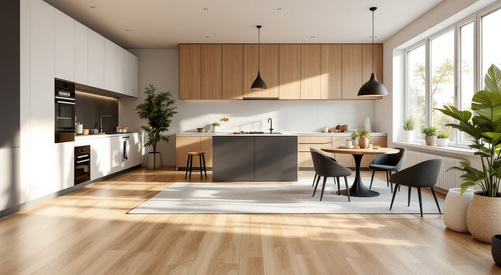
A vinyl plank colour looks expensive when four things work together: colour depth, how well the embossed texture lines up with the print, the sheen of the finish, and the plank format the colour is printed onto. Two colours can share almost the same name on a sample chart, oak, walnut, driftwood, and still look completely different once installed, because these four variables are doing the real work.
This matters specifically within WPC vinyl flooring, where the colour you see is a manufactured image and texture sitting over a waterproof composite core, not a natural material with its own built-in variation. That manufacturing process is exactly what makes colour depth controllable, and why some vinyl colours look convincingly like wood while others look like a photograph of wood. For the broader picture of how vinyl flooring is built and where it fits in a home, see Vinyl Flooring: The Complete Guide to Types, Costs, Waterproofing, and Best Uses

What Actually Makes a Vinyl Floor Colour Look Expensive?
A colour looks expensive when its printed depth, its surface texture, its finish sheen, and its plank size all reinforce the same impression instead of fighting each other. A flat, single-tone print under a high-gloss finish on a short, narrow plank reads as inexpensive even in an attractive colour. The same colour family, printed with tonal depth, textured in register, finished in matte or satin, and cut into a wider, longer plank, can look substantially more expensive.
None of these four variables works in isolation. A well-executed print with a mismatched texture still looks slightly artificial, and a well-matched texture under a high-gloss finish gets visually flattened. The expensive-looking result depends on all four decisions lining up, not any single one of them being costly on its own.
Why Does Colour Depth Matter More Than the Colour Itself?
Colour depth matters more than the specific shade because a flat, single-tone print reads as artificial no matter how attractive the colour is, while a multi-tonal print with subtle shifts in shade and grain intensity reads as natural.
Every vinyl plank starts as a high-resolution printed film bonded onto a base sheet before any texture or clear wear layer goes on top. A basic print run uses fewer colour and tonal layers, so the colour sits fairly evenly across the whole surface and a light oak stays uniformly light with little variation from board to board. A more advanced print run layers in subtler shifts within a single board, a deeper streak near a knot, a cooler undertone at one edge, the kind of quiet inconsistency real wood grain has because its colour comes from the physical structure of the material itself.
Print variety works the same way. A smaller print run repeats the same handful of plank faces across a box, so an attentive eye can spot the same board again within a few feet. A larger print run includes more unique plank faces before any repeat shows up, one of the clearest tells between an entry-tier and a premium-tier product once the floor is installed across a full room rather than viewed as a single sample.
How Does Embossing Register Change the Way a Colour Reads?
Embossing register changes how convincing a colour looks because it decides whether the surface texture you feel matches the wood grain you see, or whether the two are unrelated.
In a standard, non-registered texture, the embossing roller presses a generic wood-grain pattern across the whole sheet without tracking the printed image underneath. The floor feels textured, but a knot in the picture might sit on a smooth patch, and a grain line might fall somewhere with no corresponding ridge. In embossed-in-register texture, the embossing stage tracks the position of the printed pattern as it moves down the line, so a printed knot has a textured dip in that exact spot, and a darker grain line has a corresponding groove.
That alignment is a major reason two vinyl colours in the same shade of brown can look completely different once light hits them at an angle. A full walkthrough of how this technique works and how to spot it on a sample is covered in What Embossed-in-Register Texture Means, and the manufacturing side, how the registration is physically achieved on the line, is covered in How Is a Wear Layer Actually Made?
Does Finish Sheen Change How Expensive a Colour Looks?
Yes. A matte or low-satin finish tends to make a colour look more expensive than a high-gloss finish, because gloss reflects light in a way that visually flattens whatever colour depth and texture are actually present underneath it.
A glossy surface bounces light back in a fairly uniform direction, which competes with the subtle tonal variation a good print is trying to show. A matte or satin surface diffuses that light instead, letting the eye register the colour shifts and the embossed texture rather than the shine. This is part of why matte and low-sheen finishes have become closely associated with realistic, higher-end wood-look vinyl in recent years, while high-gloss vinyl has become comparatively rare outside specific design contexts.
Sheen also affects how a colour holds its expensive-looking impression day to day. A high-gloss surface shows dust, fingerprints, and light marks more readily, since the reflective finish highlights any variation, while a matte or satin surface camouflages the same marks in its texture. Neither effect changes how durable the floor is; it only changes how visible everyday marks are against that sheen. The full comparison of how sheen shapes a room is covered in Matte, Satin, or Glossy: How Floor Finish Changes a Room's Feel

How Does Plank Format Affect a Colour's Perceived Quality?
A wider, longer plank format makes a colour look more expensive than the same colour printed on a narrow, short plank, mainly because it reduces the number of seams and shows more of the printed and embossed detail per board.
A narrow, short plank breaks a colour into many small pieces across a room, so the eye tracks a dense grid of joints rather than the colour itself. A wider, longer plank covers the same floor area with far fewer boards, which means fewer seams, a longer sightline, and more continuous grain detail in a single piece rather than a repeating pattern chopped into short segments. A giant plank format amplifies whatever colour depth and finish sit on top of it. It does not replace them; a giant plank in a flat, low-quality print will not look expensive just because it is large. A deeper look at how width and length change a room is covered in Giant Plank vs Standard Format: How Vinyl Plank Size Changes the Feel of a Room
Entry-Tier vs Premium-Tier: A Vinyl Colour Comparison
| Design element | Entry-tier signal | Premium-tier signal |
|---|---|---|
| Colour depth | Flat, single-tone print with little plank-to-plank variation | Multi-tonal print with subtle shifts in shade and grain intensity |
| Embossing | Texture applied independently of the print (standard emboss) | Texture aligned to the print (embossed-in-register) |
| Finish sheen | High-gloss surface that flattens texture and highlights marks | Matte or low-satin surface that lets colour and texture read clearly |
| Plank format | Narrower, shorter planks with frequent seams | Wider, longer planks with fewer seams and more grain per board |
| Print variety | Small print run, repeats spotted within a few feet | Larger print run, repeats hard to spot at normal viewing distance |
No single row on its own decides whether a colour looks expensive. A product can score well on plank format and still look flat if the print itself has no tonal depth. Checking all five together, ideally on a full-size sample rather than a small swatch, gives a far more honest read than judging by colour name alone.
Does a Lighter or Darker Colour Look More Expensive?
Neither a light nor a dark colour is inherently more expensive-looking; each carries its own honest trade-off, and execution matters more than where the colour sits on the light-to-dark scale.
A lighter colour with real tonal depth can look calm and expensive, and it tends to hide dust and pet hair better between cleanings. The risk is a flat, under-printed light colour looking washed out rather than refined, since there is less contrast to disguise a weak print. A darker colour can look dramatic and grounded, but it shows dust, light scratches, and footprints more readily. Neither visibility difference says anything about how durable the floor actually is; it only affects how often a surface needs a quick clean to keep looking its best. A well-executed colour at either end of the spectrum outperforms a poorly executed one in the middle.
How to Judge a Vinyl Colour's Quality Before You Buy
Judging a colour's real quality means looking past the swatch and checking how the four variables behave together on a full-size sample, ideally under the kind of light the room actually gets.
Start by tilting the sample under raking light, light that strikes at a low angle, the same way late afternoon sun crosses a floor. Raking light is the most honest test of colour depth and embossing register, since it exaggerates texture and reveals whether a print looks flat or genuinely layered. Run a hand across the surface at the same time and check whether the texture you feel corresponds to the pattern you see; a mismatch is the clearest sign of a standard, non-registered emboss.
Next, look at more than one plank rather than a single chip, since a repeat that is obvious within a few boards signals a smaller print run. Finally, view the sample in something close to the room's actual light, near the window if it is a bright room, under the fixture type that will be used at night, since sheen and colour depth both shift depending on the light source.

Frequently Asked Questions
These are the questions buyers most often ask when they are comparing vinyl plank colours side by side.
Does a higher price always mean a more expensive-looking vinyl colour?
Not automatically. Price often correlates with better print technology, embossing register, and plank format, but the only reliable way to confirm it is to check a physical sample against the four variables above rather than assuming price alone settles the question.
Can a light-coloured vinyl floor still look expensive?
Yes. A light colour with genuine tonal depth, aligned embossing, and a matte or satin finish can look just as expensive as a dark one. What undermines a light colour is a flat, under-printed print with little contrast to work with, not the lightness itself.
Does wear layer thickness affect how expensive a colour looks?
Not directly. Wear layer thickness is primarily a durability and protection specification for the waterproof flooring beneath it, not a colour or texture feature. What does affect the look is whether that clear layer cures evenly and stays optically clear, since a hazy or unevenly cured wear layer can dull the print and texture underneath it over time.
Does a glossy finish ever look more expensive than a matte one?
In specific rooms, yes. A high-gloss finish can read as dramatic and formal in an entryway or a room built around strong directional lighting. For most everyday living spaces, matte and satin finishes are more closely associated with an expensive, realistic look, mainly because they let colour depth and embossed texture do the visual work instead of competing with reflected light.
How many different plank designs should a premium vinyl colour include?
There is no single official number, since print runs vary by manufacturer. The practical test is whether you can spot the exact same plank face repeating within a normal viewing distance across a real room or a large display area. A repeat that is hard to find at that distance is a strong sign of a larger, more varied print run.
Questions about a specific colour or format? Get in touch with your questions.
To find waterproof vinyl flooring, click here for a Caledon Floors dealer near you.