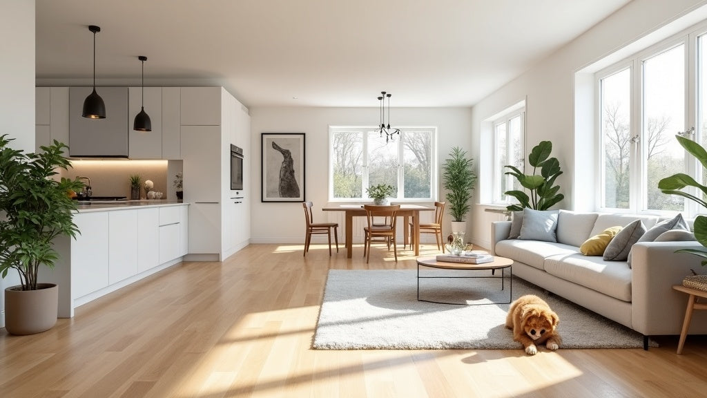
Matching floor tone starts with figuring out whether your cabinets, trim, and walls lean warm or cool, then choosing between two honest strategies: blend the floor into that same temperature for a calm, unified look, or contrast it deliberately for definition. Undertone comes before shade. And no decision is final until a large sample has been tested in the room's actual daylight and artificial light, not a showroom's.
That is the short answer. The rest of this guide covers how to read undertones accurately, when to blend versus contrast, how trim fits into the equation, and why the exact same floor sample can look like two different colours between a store and a home.
What Does "Floor Tone" Actually Mean?
Floor tone is not just light versus dark. It is the underlying colour temperature, or undertone, that shows up once you look past the surface shade. Two floors can be nearly identical in lightness and still clash, because one carries warm undertones (red, orange, amber, gold) and the other carries cool undertones (grey, ash, taupe, blue-grey).
Undertone is the detail that decides whether a floor and a cabinet "go together" or quietly fight each other in a room, even when both look neutral on their own. This is the same logic covered in more depth in our guide to choosing an engineered hardwood colour, and it applies just as much to cabinets, trim, and walls as it does to the floor itself.
How Do I Know If My Cabinets, Trim, or Walls Are Warm or Cool?
Hold a plain sheet of white paper next to the material and look at what colour it pulls toward. Warm materials read slightly yellow, peach, or golden against pure white. Cool materials read slightly grey, blue, or pink.
A few practical tells:
- Wood cabinets with visible red or orange grain (cherry, oak with an amber stain) are warm.
- Wood cabinets that look ashy, greige, or driftwood toned are cool or neutral-cool.
- Painted cabinets described as "warm white" or cream lean warm; cabinets painted a true or "cool" white lean cool.
- Stark white trim and baseboards almost always read cool next to a warm floor, and can look dingy next to a very cool floor if the whites do not actually match.
Do this test in the room itself, not in a paint aisle or showroom. Store lighting shifts undertones more than most people expect, which is covered in detail further down.

Should My Floor Match My Cabinets, or Contrast Them?
Both are legitimate strategies. Neither is more correct than the other; they create different effects, and the right one depends on the look you want and the size and light of the room.
Tonal Blending
Tonal blending keeps the floor within the same warm or cool family as the cabinets and walls. It produces a calm, cohesive, larger feeling space, because the eye is not stopped by a hard colour break at the cabinet base. This is usually the safer choice in smaller rooms or open floor plans, where continuity matters more than a single strong focal point.
Contrast
Contrast pairs a floor and cabinetry from opposite temperature families, most often a warm floor under cool-toned cabinets, or a deep floor under light cabinetry. It produces a more defined, editorial look, where the floor reads as its own design element rather than a backdrop. This is one of the choices that separates a flat-looking room from one that reads as genuinely designed, a distinction covered from a different angle in our piece on what makes a home's flooring look more expensive.
Neither approach requires matching the wood species or material type exactly. What matters is matching, or deliberately opposing, the undertone.
Tonal Blending vs Contrast: A Quick Comparison
The two strategies solve different problems, so the right pick depends on the room more than a fixed rule.
| Tonal Blending | Contrast | |
|---|---|---|
| Visual effect | Calm, cohesive, spaces feel larger and more connected | Defined, graphic, floor reads as its own design element |
| Best suited to | Smaller rooms or open-concept spaces where flow matters most | Larger rooms or spaces that can support a stronger focal point |
| Undertone rule | Floor and cabinets or trim share the same warm or cool family | Floor and cabinets or trim come from opposite temperature families |
| Risk if overdone | Can feel flat or monotonous without texture or layering | Can feel busy or dated if more than two strong tones compete at once |
| Where it shows up most | Whole-home flooring, hallways, connected living and kitchen areas | Statement kitchens, single defined rooms, accent areas |
How Does Trim Colour Fit Into the Equation?
Trim acts as the connective tissue between the floor and the walls, so its undertone matters more than its brightness. A true, cool white trim next to a warm floor and warm walls can look slightly grey or flat by comparison. A warm white or cream trim next to cool cabinets and a cool floor can look slightly yellowed.
The simplest approach is to treat trim as a supporting neutral rather than a separate decision: pick a trim white from the same undertone family as whichever element, floor or cabinets, is doing more of the visual work in the room. In a contrast scheme, trim usually pairs with the cabinets, since it sits at the same eye level and reinforces the same colour story. In a blended scheme, trim can lean toward matching either the floor or the walls, since everything is already in the same family.
Why Do Showroom Samples Look Different at Home?
This is the most common reason a floor choice disappoints after installation, and it has nothing to do with the flooring itself. Light sources have different colour temperatures, and that temperature changes how the eye perceives colour.
Daylight shifts throughout the day: cooler and bluer in the morning, warmer near sunset, and different again on an overcast day versus direct sun. Indoor lighting adds another layer. Standard warm-white bulbs push every colour toward yellow and amber, while cool-white or daylight-rated LEDs push the same colour toward blue and grey. A showroom is typically lit with consistent, flattering, often warm-toned lighting designed to make every floor look good, which is exactly why it is not a reliable preview of how that same floor will look in a specific home.
This effect has a name in colour science: metamerism, where two colours, or the same colour under two different light sources, appear to match under one type of light and mismatch under another. It is a real, well-documented optical phenomenon, not a flaw in judgment, and it is the reason professional designers never finalize a material choice from a single lighting condition or a single showroom visit.

How Should I Test a Floor Sample Before Deciding?
Get an actual physical sample, as large as reasonably possible, and bring it into the room being decorated rather than judging from a small chip or a photo. From there:
- View it at three different times of day: morning, midday, and evening, since natural light shifts colour temperature throughout the day.
- View it under the room's actual artificial lighting after dark, not only in daylight, since most rooms get used in both conditions.
- Lay the sample flat on the floor rather than propping it upright, since light hits a horizontal surface differently than a vertical one.
- Hold it directly against the cabinet door, a paint swatch, and a trim sample, rather than judging each material in isolation.
- Step back and view it from normal sightlines, such as a doorway or a favourite chair, not just standing directly over it.
If a sample still looks right across all of these conditions, it is a reliable choice. If it only looks right under one type of light, treat that as useful information rather than a reason to force the decision anyway.
These same undertone and lighting principles apply across material categories. Whether the comparison is engineered hardwood, laminate, or WPC vinyl flooring, undertone and light behave the same way regardless of what the floor is made from. If the room in question is a kitchen or bathroom where waterproof flooring is the priority, test the sample in that specific room, since it is often lit differently than the rest of the home.
Do Floors Need to Match in Every Room of an Open-Concept Home?
Not necessarily, but they do need to relate to each other. In an open-concept layout where a kitchen, dining area, and living room share sightlines, an abrupt, unrelated floor tone change reads as an obvious seam rather than an intentional design choice. The floor does not have to be identical everywhere, but staying within the same undertone family across connected spaces keeps the transition feeling deliberate. Our guide on whether to use the same flooring throughout a house covers this decision in more depth.
Closed-off rooms, such as a bedroom behind a door or a separate powder room, have more flexibility to break from the rest of the home's tone, precisely because they are not visually connected to it.

Frequently Asked Questions
A few quick answers to the questions that come up most often once the undertone and lighting basics are settled.
Should trim match the floor or the walls?
Trim should share the undertone of whichever element is doing more visual work in the room, typically the cabinets in a contrast scheme, and either the floor or the walls in a blended scheme. Matching lightness matters less than matching temperature.
Can a warm floor work with cool grey cabinets?
Yes. That is a classic contrast pairing, and it is a common design choice specifically because the temperature difference gives the space definition. The key is keeping the rest of the room's neutrals, including trim, countertop, and wall colour, from introducing a third competing undertone.
Does floor finish change how the tone reads?
Yes. A glossier finish reflects more light and can intensify both the colour and any undertone shift between light sources, while a matte finish diffuses light and reads more consistently across different conditions. Our guide to how floor finish changes a room's feel covers this in more detail, and it is worth weighing alongside undertone rather than instead of it.
How many different undertones can one room handle?
As a practical guideline, most rooms read best with no more than two dominant temperature notes, for example a warm floor with cool cabinets and a neutral wall, rather than three or more strong warm and cool elements competing for attention at once.
Does the floor need to match the wood species of a table or trim?
No. Matching species is not the goal, and mixing wood species and tones is now a common, accepted design approach. Matching undertone is what actually matters, not matching the type of wood or material.
If you are weighing a specific pairing and want a second opinion, reach out with your photos or samples.
To find waterproof vinyl flooring, click here for a Caledon Floors dealer near you.